
This is part of a series of Session Notes from grantees who have received Professional Development grants from the Office of Commonwealth Libraries. Each grantee will share their professional development experience and include tips and other resources from the workshop or class. Grantees had their choice of an article for the Compendium, a webinar or a podcast. This project was made possible by the Institute of Museum and Library Services.

Rachel Cox,
Temple University Libraries
Submitted by Rachel Cox
Temple University Libraries
The only thing that could have possibly improved my experience at Elements: The Web Conference at Penn State would have been leaving my massive head cold at home in Philadelphia. Unfortunately that technology doesn’t exist yet[1] and I spent my first night in Happy Valley taking shots of Nyquil whenever a Game of Thrones character appeared onscreen wearing black leather. Come Monday morning I leapt out of bed, showered in my weird shower with no soap ledge, did a Home Alone scream when I realized that I wouldn’t be able to taste any of the free food[2] for the next three days, and hit the breakfast buffet anyway.
I am not an academic. I work in a library but I am proud to say that none of the librarians’ quiet dignity or fifty-cent words have rubbed off onto me. I am a print and web designer for Temple University Libraries and I came to Elements to learn more about accessibility for the web. I wanted to gain a deeper understanding of this very complex issue that I can use moving forward whenever I edit or add content to our website. (Pssst! Did you know that even PDFs can be made accessible?) I also secretly hoped to learn enough to be considered an “accessibility expert” around the library[3].
I think Elements should become a mandatory requirement for anyone working in higher education because they completely won me over. I arrived as a designer who viewed accessibility requirements as a hindrance and left as a designer who feels deeply that making the web universally accessible to everyone is an exciting challenge. An architect doesn’t say to themselves, “Geez, this building would look so much better without doors. Why do we need these stupid doors here?” Instead they say, “I am going to make the best-looking doors anyone has ever seen! People will bow down before my amazing doors!”[4]
 An estimated one in five humans on this planet are disabled (one billion people worldwide), which means that a limited access website is potentially losing 20% of its users, which for an online business can mean lost customers[5]. These disabilities can be broken down into five categories: visual, motor, auditory, and cognitive. When we think of someone with a disability using the internet, most of us visualize a blind person using a screen reader. But the presenters in the Accessibility track gave many examples of other personas that we might easily imagine having difficulty accessing web content: a person who was born deaf for whom English is a second language, who struggles with long blocks of dense text; an arthritis sufferer who can’t use a keyboard or mouse sometimes; a person with motion sickness who starts to feel physically ill looking at a parallax scrolling website.
Denis Boudreau’s presentation was entitled “The Ones We Forget: Designing for One of the Largest Minorities on the Web.” He said something that really stuck with me, which I will paraphrase here. In the late 1990s, the web was all “Flash this” and “Flash that,” and there were major accessibility issues. Twenty years later we are creating the same problems for ourselves with HTML5, CSS3 and Javascript. History is repeating itself and we don’t seemed to have learned our lesson.[6]
Just a few weeks ago I was looking for examples of websites to use as a model for a new microsite. I gravitated towards a splashy parallax site, knowing it wouldn’t be considered ADA-compliant and feeling frustrated. Parallax was mentioned in a few of the presentations and the consensus seemed to be that it was ok to use as long as the user has an option to turn it off. This also applies to animations.
Devon, who is an Accessibility Specialist, gave a presentation that was simple and straightforward. She outlined their philosophy and methods for testing clients’ websites. She said the focus should not be on building “a thing” but on what the user is going online to accomplish. Let go of all your assumptions of how users with disabilities use technology and focus on a holistic approach. She also stressed that just because something meets the WCAG 2.0 guidelines does not guarantee usability. Additionally, something might work well in one context but fail in another situation.
Devon was the first person I ever heard mention ARIA, which stands for Accessible Rich Internet Applications, and “is a technical specification published by the World Wide Web Consortium (W3C) that specifies how to increase the accessibility of web pages.” ARIA should be used to get your feet wet but is not considered the last word on the subject of universal access. One small technical piece of advice that I will remember from Devon’s talk is that low-vision users are often looking at a browser window differently than you would expect: extremely zoomed in; reduced so small that nothing is visible (the window doesn’t need to be expanded for a screen reader to access the content); or just reduced enough that they’re viewing the tablet version.
Seated at breakfast on the second day, I was lucky to have Devon Persing, an Accessibility track presenter from the previous day, sit down next to me. I proceeded to barrage her with questions about her line of work. She used to be a librarian so she understood where I was coming from. My background is in marketing, so I suggested that her company, Simple Accessible, should promote themselves as an employer of disabled people (their usability testers). Devon was too polite to call me crass and commercial but I could see in her eyes that she was thinking it.
Heather Migliorisi, a software engineer at BlackHawk Network, gave a talk titled “Accessibility Implied,” from which I took a few pearls of wisdom. She introduced me to the WCAG 2.0 concept of POUR, another wonderful acronym meaning Perceivable, Operable, Understandable, and Robust. She stressed that accessibility is not a feature of a website but part of the foundation. Ideally it should be considered a product goal and not one of the duties of a single employee, which seems to be a common practice. Migliorisi also recommended www.pa11y.org for free accessibility testing and the Hemingway App to help simplify your text.
A few presenters, Heather included, mentioned KISS when designing for access: Keep It Simple, Stupid. KISS can come in handy when writing alt tags for your images and scene descriptions for videos. Sometimes more is less. For example, for a video description, we don’t need to hear “John Smith, the bar manager with blonde hair, crosses the street” when the user might only need to know “a man crosses the street.” The critical concept is to convey meaning instead of just accuracy.
Billy Gregory went into technical details about captions, transcripting, and video descriptions in his presentation, “AD, CC and Me: Lessons Learned in DIY Video Accessibility.” Billy is a Senior Accessibility Engineer at The Paciello Group and also hosts a YouTube show called The Viking and the Lumberjack that discusses accessibility issues. He recommended Accessible Media, a resource for accessibility best practices. They have a reality show set in Montreal where four differently-abled people live together, which I wish I could watch. Other hot tips for videos: Don’t interpret emotions; Be consistent with references.
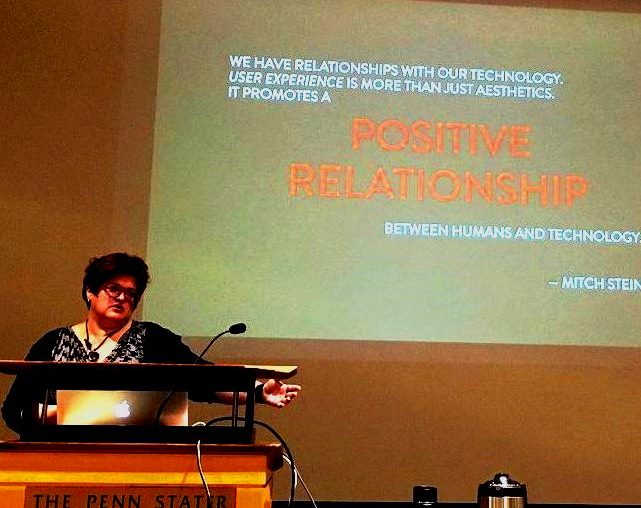
In addition to the eight Accessibility track presentations that I attended, one of the keynote speakers gave an emotional talk about trying to access a hospital website in the midst of a family crisis. Eric Meyer, a famous web dude, was trying to make a point about accessibility. In addition to all the personas we imagine are using our website, we also have to imagine someone under duress trying to access information that they desperately need. Websites for hospitals, AAA, and other emergency services are accessed by people under stress all the time, and their needs should also be accounted for.
The theme of universal access was not only present in the presentations at Elements, but in the inclusive atmosphere. Everyone I spoke with was warm, engaging and passionate about their work. Most of the attendees were higher education professionals, so I shouldn’t have been surprised at how willing they were to teach me.
[1] Although during the long drive I did imagine a short story set in the near future where everybody goes into temporary suspended animation when they get sick. This idea is free for any aspiring Robert Heinleins out there.
[2] My favorite thing, ever.
[3] The only thing I have ever been an expert at is Seinfeld trivia, which doesn’t get much respect.
[4] If you make all your doors 48” tall this is almost a guarantee.
[5] Did you know that Amazon’s desktop website isn’t universally accessible? They want you to use their mobile site if you have an impairment: www.amazon.com/gp/help/customer/display.html?nodeId=200259430
[6] This made me feel a little bit better about not mastering any of these languages.